
By Steve Isaac, Content Marketing Producer, Carto
We wanted to see how maps can be used to assess the level of social media engagement among users. So, we decided to zoom into a recent Twitter project. Here’s the story:
On 8 January 2018, CJ Marple, a 3rd grade teacher at Osage City Elementary School, Kansas, US, began a lesson exploring the speed and distance that information can travel using social media.
Marple, an active twitter user, worked with his students to compose a tweet, with the intention of mapping the social media engagement as the message spread. It isn’t hard to imagine CJ and his students’ surprise as the tweet began to pick up steam, go viral, and circle the globe.

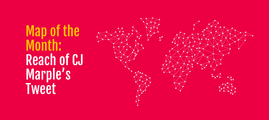
With over a million and a half total engagements, retweets from several celebrities (including Modern Family’s Eric Stonestreet, former White House Press Secretary Dana Perino, and US Senator Jerry Moran), and responses from across the world, CJ’s tweet proved shockingly effective.
He had initially set up a map in his classroom to flag retweets using post-it notes, but as the tweet continued to go viral and the data points continued to pour in, that solution likely proved untenable. To help CJ out, Twitter stepped in:
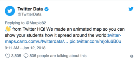
Twitter used CARTO to visualise the location of retweets, mapping out the spread of the data and in doing so, were able to create an extremely valuable teaching tool for CJ. Not only did their map represent the locations of each retweet, but it took Twitter’s temporal data into account.
Related: This is How Location Data Can Resolve the Global Refugee Crisis

By creating an animated time-scale map, Twitter was able to fully visualise CJ’s lesson. The time-scale map provides a more complete view to CJ’s students, not only showing them where their information had spread, but also when and how, presenting the pattern of retweets using a histogram.
When discussing what led them to put together this map, Elaine Filadelfo, Data Editor at Twitter noted:
“This story was the perfect fit for using CARTO. We could clearly visualise the original tweet being posted in Kansas, and then watch as it spread regionally, nationally, and globally over the following days.”
At its core, visualising our location data empowers us to further understand the world around us and the systems that we interact with every day. CJ noted that “looking at the data, the thing that was really crazy for them to see (and their big takeaway) was where it was getting retweeted.”
With retweets from Chile to China, location intelligence helped a class of 3rd graders from Kansas see just how connected to the wider world they truly are.
Article first appeared on the CARTO Blog.
Lava is an authorised Partner of Carto in Malaysia and with more than a decade of experience in the industry, we’re proud to say we’re one of the leading cloud consultants and service providers in the Asia Pacific region.